
Anglicare Sydney
Website Redesign
“I love it! Definitely feel like it meets the goals.”
- Anglicare Sydney Staff
Academy Xi Group Project with live client
Role: UX/UI Designer
Responsibility: End-to-end delivery
Timeframe: 12 weeks, December 2022
Tools: Figma, FigJam, Zoom
Reshape Toys ‘n’ Tucker as a new ‘hybrid’ model with meaningful donation pathways.
This problem statement evolved after a few meetings with key stakeholders.
It landed on a more donor focused approach and not an end product deliverable.
What does the research tell us?
A common theme that stood out with the interviewees was that they trusted what Anglicare represented and how they distributed the donations. Donors were willing to give both physical and online contributions.
-
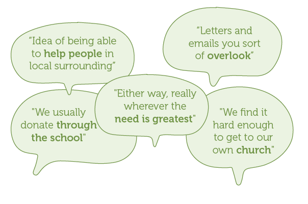
I prepared a research survey which I planned to email to donors. I obtained a registered donor list from the Anglicare Fundraising team. I Consulted with the head of fundraising who suggested I call the donors as this was a softer and friendlier approach. I spoke to 10 donors who completed the survey and this is some of what they said.
-
I conducted desktop research looking at similar industry groups that have donation functions as part of their experience. I did this to gain a deeper understanding of the community fundraising space from a functional practical and usability perspective. I noticed some good examples of customer testimonials through images and stories that connected with donors and encourages further interaction.
-
The purpose of the 1on1 interview with the GM Community Fundraising was to share and understand some of the Salvos recent experience with donor engagement specially during recent COVID restrictions. This really helped me discover opportunities for Toys'n'Tucker community approach through Facebook and technology. By introducing QR code and utilise Facebook campaigns for border engagement and data tracking.
Snapshot of key findings
Donation pathways
Hybrid donations, can some what feel confusing and frustration
Brand recognition
Anglicare is a trusted brand amongst the church communities
Competitors
Enhance the sense of purpose and tangible impact by providing clear dollar amount options for online donations
Behaviour
Donors are willing to shift from traditional toy and food donations through churches to adopting a more impactful approach by contributing monetarily to provide assistance to those in need
Technology
Our community are willing to embrace technology because of COVID, providing cashless tap and go machines at churches
Prays and story telling
Donors who hear about causes through their church often find a deep sense of meaning and purpose in contributing back to their community
Research synthesis

Affinity Map
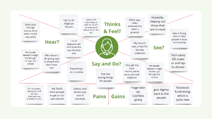
Empathy Map

“Through the local church, we've done a lot with Anglicare. I trust Anglicare will distribute the toys the best way”
Meet Ruth Johnson
>
Meet Ruth Johnson >

Age: 40 | Work: A Small
Business Owner
Family: Married with two teenagers
Location: Kellyville
I am designing for Ruth
Ruth, is a small business owner and is comfortable to do things online. A mother of two young teenagers who attend local Anglican schools. Goes to an Anglican Church regularly with the family. She enjoys outdoor activities and baking. Ruth struggles to find time to give back to the local communities while juggling the pressures of motherhood.
-
Successful juggling motherhood and running a small business
Devoted Christian, actively helping those that are in need
-
Struggling to find time do things for others
At times finds it challenging to Church
Donating the wrong things for people
Receiving too many letters and emails, she tends to overlook them
-
A traditionalist and Christian. Christmas is sharing the love of Jesus Christ
Trying to manage work like balance and finding the time to give back to local communities
Comfortable with online transactions for personal and business use
-
Knowing that she can help people in local surrounding
Connection to her church being the hub for Toys’n’Toys collections
Confident when receiving guidance from Anglicare and the Church on how to contribute online
She trusts Anglicare will distribute the donated funds and toys in the most appropriate way
Ruth’s current journey feels like
At each touchpoint, Ruth's emotions are visually captured. Frustration and confusion peak when she tries to contribute online due to an outdated and clunky website interface, making it difficult for her to donate.
-
Ruth has been donating toys through her child’s school and dropping off food to the local Church. Ruth is feeling a little overwhelmed with the physical commitment to give back. She hears through Church that online donations are another option to contribute.
-
Online donations should offer a seamless and user-friendly experience, while creating a sense of tangibility and purpose, empowering individuals to make a meaningful impact and dignifying those in need.
-
Improve our Toys’n’Tucker shopping list to cater for diverse communities. Introduce a broader selection of food hampers eg; Asian, Indian, gluten free, etc
Trial paid Facebook ads to grow engagement and connections with communities that are not associated with the Anglican Church.
How might we make the online donation pathway functions more accessible and visually pleasing
How might we improve our Toys’n’Tucker shopping list to cater for diverse communities
These HMW questions emerged as the strongest and most suitable. I pivoted my problem statement to turn those challenges into opportunities.
Wireframe for mobile interface
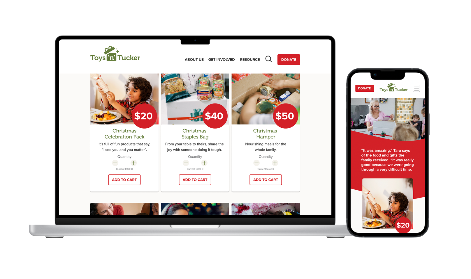
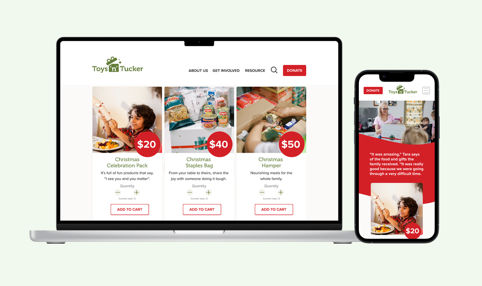
How can the current website information be organised to help users donate with easy? My analysis of the current Toys’n’Tucker website found that the donate button was hard to find. To make it easier for donors I proposed that the “Donate” tab be positioned with navigation menu and not buried under the “Shop” tab.
Ruth, a compassionate giver, has been donating toys and food locally but feels overwhelmed by the physical commitment. She recently learned about the option of online donations through her church, which offers convenience and a broader impact.
User flow - Donations
-
The donate button stands out and is easy to click. Each item on the website has a small description that makes it feel real and meaningful, giving you a clear purpose for supporting those in need. A personalise donation amounts provides a gratifying sense and positive feeling.
-
Improve our Toys’n’Tucker shopping list to cater for diverse communities. Introduce a broader selection of food hampers eg; Asian, Indian, gluten free, etc Trial paid Facebook ads to grow engagement and connections with communities that are not associated with the Anglican Church.
-
The opportunity is to create a user friendly donation platform for Toys'n'Tucker that encourages people to make online donations as their primary action, while also allowing them to contribute physical toys or food if they prefer. Additionally, establishing a connection to Anglicare's brand Facebook page will help raise awareness and engagement. This approach provides a flexible and inclusive way for individuals to support Toys'n'Tucker and make a positive impact on those in need.

The red “donate” button is very clickable